Chicken
Design and UX for a messaging app designed to break down the barriers in communication
"Want to come build an app in a weekend?"
That was the question from my friend and entrepreneur Stefan Djordjevic one evening after a workout. The plan was to rent a house and dive into a weekend hackathon designing and building as much as we could of Chicken, a messaging app concept he'd been developing for a while.
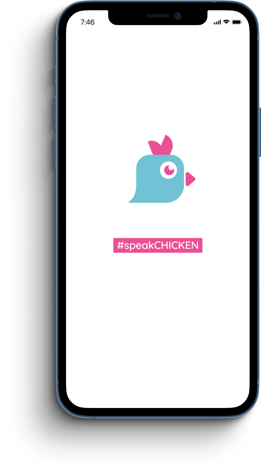
Chickens are exceptionally social creatures, a fact that was new to me, and the idea was to create a video messaging app that bypassed all the popular filters and editing and got straight to the point. So on a Friday night in late May 2019 we crammed a handful of designers, developers, and marketers into the living room of an east Austin house and got to work. My role was handling the user experience of the app as well as designing the UI and offering art direction support, and attempting a project like this in a weekend proved to be a fun challenge.
As the goal was to create something different than other messaging apps were currently providing, we started off with a casual competitive analysis discussion to clarify our concept and determine the primary features we wanted to include in the project. We landed on the idea that Chicken would initally focus solely on video messaging with no editing or text messaging capabilities, with the goal of promoting the idea that it would provide authentic communication with no ability to filter or edit your message. We also discussed ways to potentially gamify the app by doing things like keeping track of points and rewarding users for streaks of messages. After that the art director and I started brainstorming and sketched identity concepts for a few hours, landing on a logo that combined ideas from designs we'd each created, before heading home to recharge before picking back up on Saturday.

Wireframes and research and interviews, oh my!
The compressed timeline meant that flexibility was key and research and testing would be done on the fly. I began whiteboarding messaging userflows and wireframes while a few team members researched onboarding best practices and our art director developed more of the visual language and branding for the app and marketing site. I also had the opportunity to help out with some copywriting, helping some other team members refine the language to hit the desired irreverent tone we wanted to show in the marketing materials and the app itself.
I started building out first pass wireframes in Sketch while taking breaks to discuss user research and help with interviews. We started off focusing on two main demographics, tweens and later high school/college age users, with the idea that younger age groups already very comfortable with apps like FaceTime and Snapchat would be receptive to the idea of Chicken. (We also discussed the app's use for families and slightly older users but decided to focus on younger demographics first.) Talking with potential users in these groups helped up refine as well as eliminate a variety of features. One idea that was discarded (at least for the early MVP version) was a reminder or calendar function, none of our potential users responded to the idea and we felt that trying to focus on that functionality would distract from the core development of the app. We did decide to introduce a basic version of the gamification idea with the intent to develop the concept further in later versions.
My next step was building clickable wireframe prototypes of different flows in the app in InVision so that could be tested both within the development team and with test users. From there I started developing UI elements and building out the user flow screens while we continued to refine the messaging flows.

Early wireframes for Chicken
Wrapping up the weekend
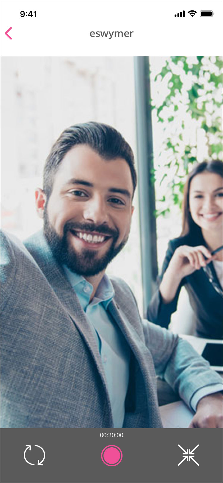
On Sunday, the final day of our hackathon, the development team was making progress on sending and receiving video messages and had started implementing a very rudimentary version of the app in an iOS framework. After some discussion to lock in our initial user flows, I took the UI elements I'd designed on Saturday and started created high resolution screens for the app.
After playing with some different ideas on group messaging and recording a video before deciding who to send it to, we decided to take a pretty straightfoward approach for the MVP of the app and use a messaging flow similar to Apple Messages or DMs on Twitter or Instragram. I created a set of default user icons and designed screens for the messaging/video functions as well as friend requests and and settings. I turned that into a quick prototype in InVision that we tested with a few users in our last testing session, and they responded well and had positive feedback. By the end of the day our developers had a rough implementation of sending and recording video messages running on an iOS device and we'd launched a promotional site, mailing list, and social media accounts for Chicken showcasing our high resolution screens.


So it turns out you can't build an app in a weekend
Or at least we couldn't quite get this one finished. In the upcoming weeks, however, our developers were able to get an initial test version of the app up and running with the primary functionality that we then released to a small beta group. I continued to provide UI and UX support, updating icons and UI elements and refining some of the messaging experience as we made small adjustments based on user feedback.
A few weeks later (and after multiple rejections) we launched Chicken in the App Store and were able to acquire a userbase of a few hundred users. Feedback from our users was good and we had plans to further develop the application, but the people in charge of the project unfortunately weren't able to continue financially supporting the servers needed for sending and storing video and we were forced to shut the project down after a few months.
While in the end the project wasn't a success financially it was a fantastic learning experience that I really enjoyed. It gave me the chance to work with a small, agile team that was forced to make quick decisions and decisively choose a path forward, and from there we could test and evaluate before either continuing on or revising the feature. That rapid process was really the perfect UX testing ground, while it didn't allow for the in depth research or testing that would be preferred it did provide for a quick cycle of designing, testing, and iterating that resulted in a better product. I'm already looking forward to the next weekend hackathon.