CHARLES RIVER LABS
Helping Scientists Find Critical Study Anomalies in Minutes, Not Hours
Redesigned the Clinical Observations modules of Charles River Labs’ Apollo platform from a massive data table into targeted visual dashboards, enabling scientists to spot anomalies exponentially faster and saving thousands of dollars in analysis time per study.
COMPANY
Charles River Labs
ROLE
Lead Product Designer
TEAM
Product Owner, 2 Engineers, Data Team, Design Director
TIMELINE
8 weeks plus development time
Why This Project Mattered
Pharmaceutical scientists could spend hours looking for anomalies inside huge tables of numeric data, sometimes taking up large parts of their day to find just a few pieces of information. With studies sometimes lasting six months or more, that added up to hours of wasted time per week that could have been spent on higher value work.
What We Learned: Anomalies Matter, Not Every Data Point
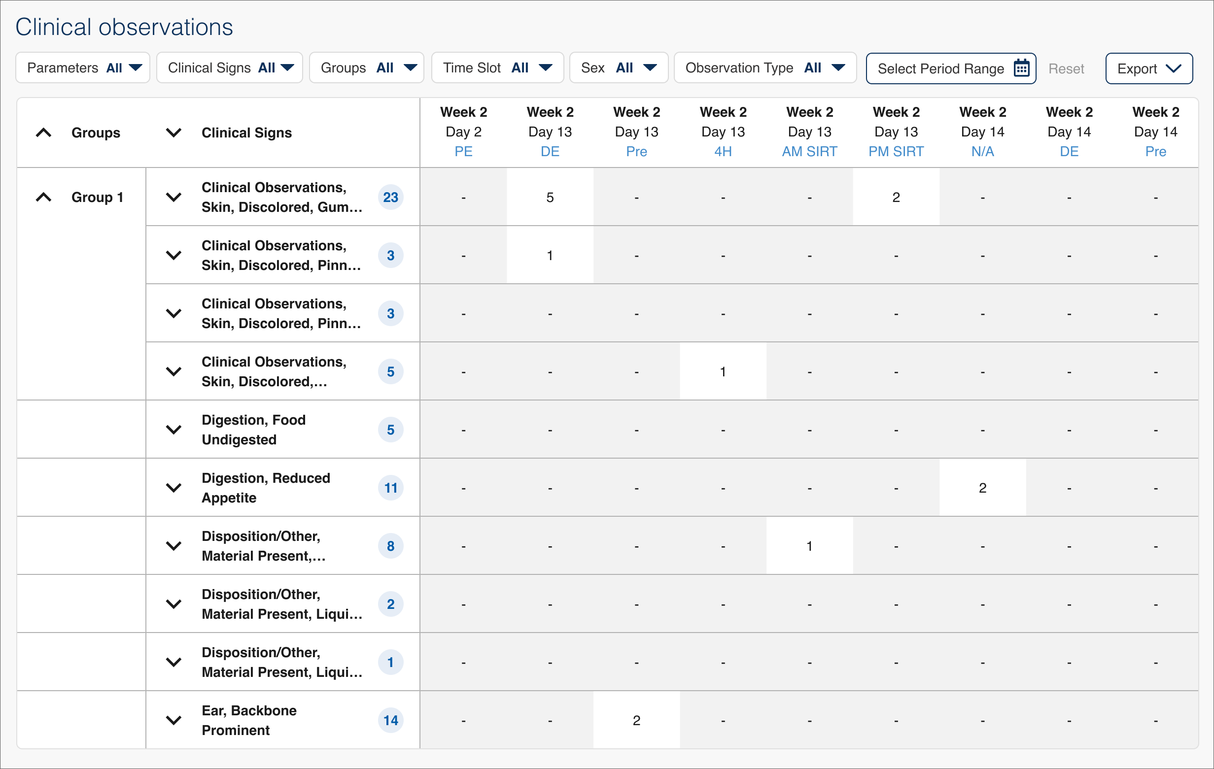
The initial version of the Clinical Observations module (Clin Obs for short) was designed before I started on the project and was made up of a huge table of numeric data that could be sorted and reviewed in more detail. I did several weeks of user interviews with study monitors (the personnel at pharma companies who track studies of specific drugs) and study directors (the CRL personnel who run the studies) to learn how users were currently using this and other modules of Apollo. The primary takeaway was that while the data table did show all the needed readings, it was very difficult to find any meaningful information in such a huge data set and wasn't very useful if a user didn't know specifically what they were looking for.
In these studies a scientist is generally looking for anomalies, trying to find spikes or changes that could then be investigated to determine the root cause. The biggest shortcoming in the initial version of Clin Obs was that the data couldn't be ordered by frequency of occurrence, meaning a scientist had to scan the entire table looking for those anomalies (imagine having to compare numbers on a scrolling bingo card the size of a newspaper).
Studies could last three to six months or more, meaning a user also had to horizontally scroll a long timeline of entries to view all of the data and evaluate when things occurred. Large studies could also take a long time to load, something that would only increase as the platform added more customers and studies.
This made the Clinical Observations module ripe for UX improvements. Instead of helping users read every number, we needed to focus the design on helping them answer "Where should I investigate first?" as fast as possible.
Exploring new ways to display the data
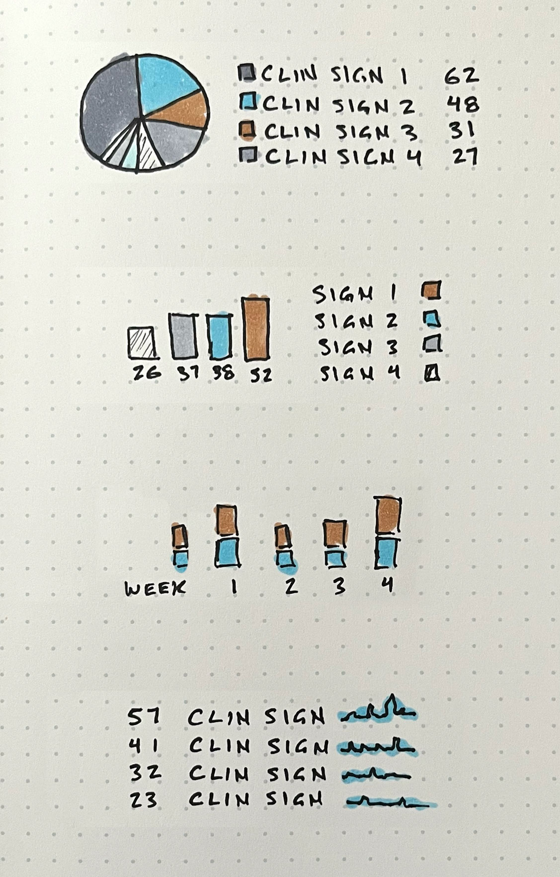
I spent some time sketching and researching different graphs, dashboards, and other methods of visualizing data, looking for ideas that we could translate into better ways to quickly analyze Clin Obs data. I explored a variety of charts and graphs, looking at everything from pie charts and bar graphs to ways to graph occurrences of clinical signs over time.
User Testing: Evaluating Graph‑First Views Before Redesigning the Product
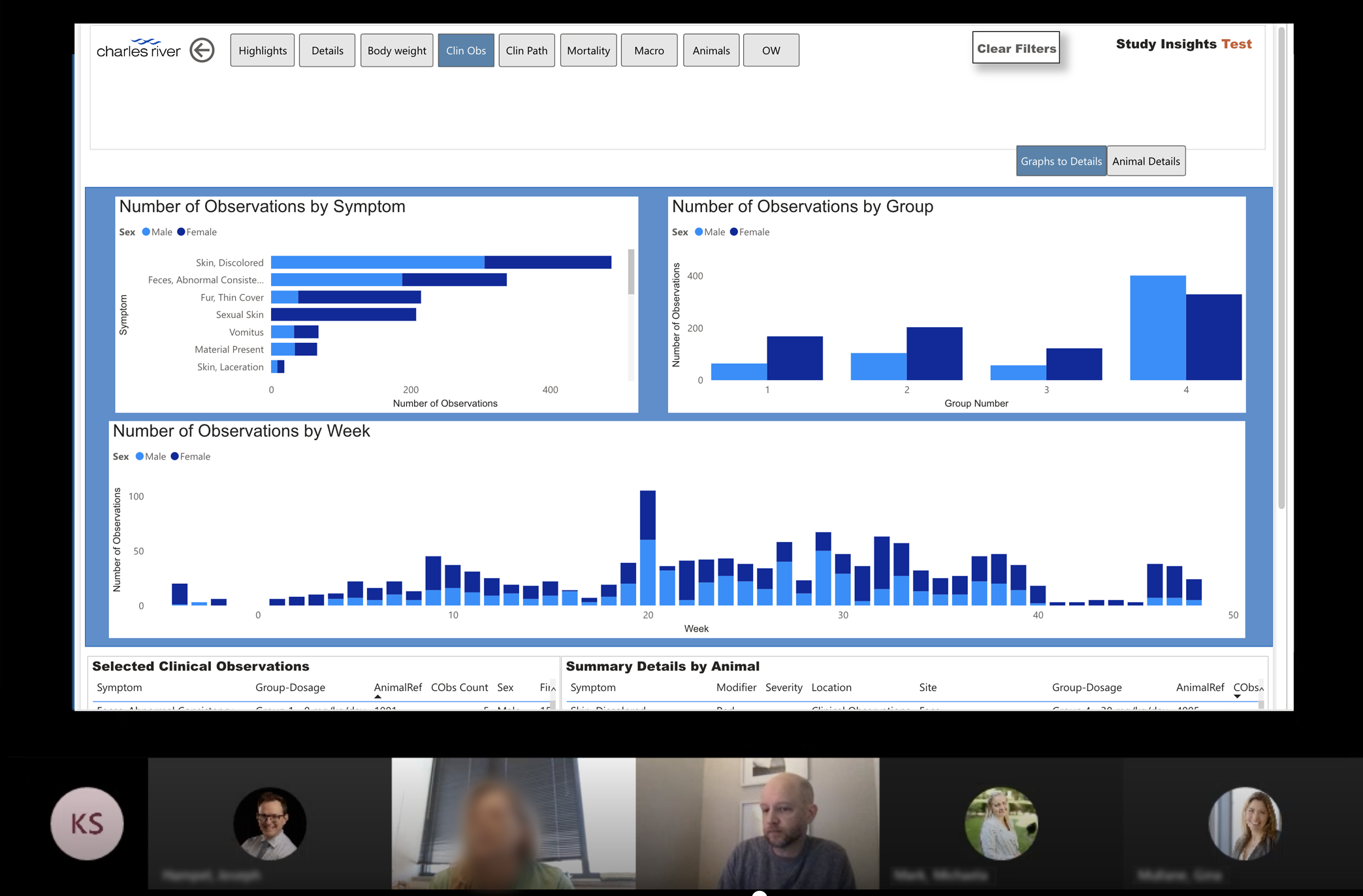
Some members of our data team had started to explore graphing Clinical Observations in Power BI, taking recorded study data and displaying it in a bar graph format in different ways. The visual design and UX of the prototype was far from ideal (literally any item that was clicked would trigger loading something else) but it provided a great starting point for testing these concepts with users.
Comments ranged from "game changer" to
"can I have this now?"
I tested the Power BI prototype with over a dozen external users and a panel of internal study directors, asking them to first talk me through their thoughts as they explored it then showing them specifically how it worked. Users were thrilled with the visual format (comments ranged from "game changer" to "can I have this now?") and had lots of positive feedback. We confirmed that quickly being able to find those anomalies was key, if they could easily find places where the data varied in a way they didn’t expect they could investigate that to learn more about what was happening. Being able to find those spikes then filter the numeric data by those specific occurrences would have huge benefits, not only greatly increasing their efficiency of interpreting the study data but making it much easier for them to summarize and present findings to their teams.
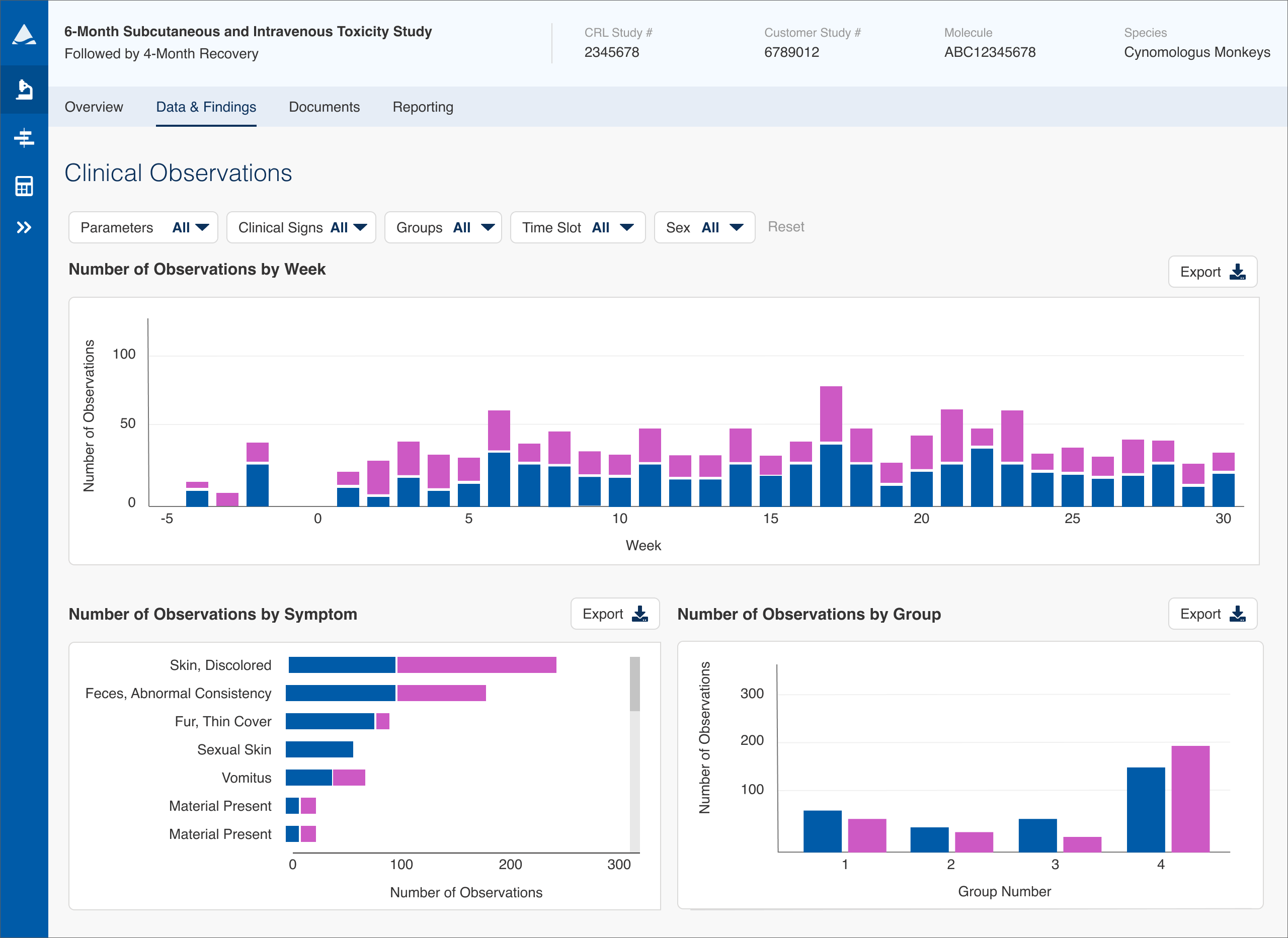
The Solution: Targeted Graphs That Point Scientists to the Right Questions
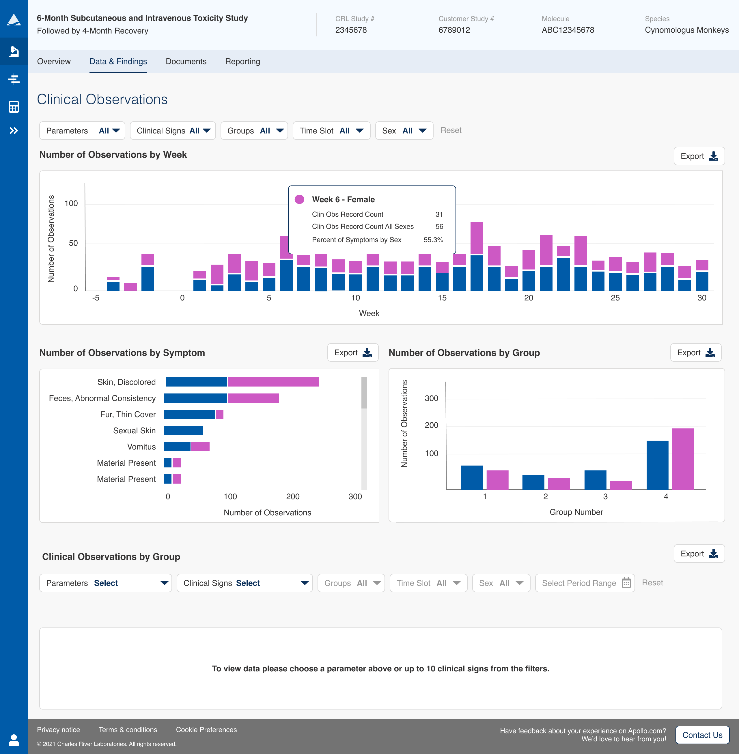
After reviewing our user interviews, we decided that showing the occurrences over time, frequency of occurrence by symptom, and number of occurrences by group would provide much more meaningful and digestible results and cover most use cases. I designed graphs to correlate with these then worked extensively with the data team to enable access to the data streams needed to load those graphs up front.
The module was designed so that a user could review the graphs then choose a clinical sign to see detailed data on that sign. We also added the ability to dig deeper to see all data on a specific animal in the study, a feature that had been often requested in the past. This both made it much faster for users to find issues to investigate and greatly reduced page load times by massively reducing the amount of data being requested from the CRL servers.

The Results: Huge Time Savings and Earlier Detection of Critical Issues
Follow up testing received rave reviews from our beta users. Clinical Observations had evolved from a giant table of data into a quick to interpret set of graphs that solved many of our users’ pain points and made their use of the application far more efficient. In early testing, users estimated the new version will reduce the time to find an anomaly from as much as an hour to only minutes every time they review the study data. The direct result of this is thousands of dollars saved in time spent analyzing study data.
The updates also have the potential to save companies hundreds of thousands of dollars by enabling scientists to be more proactive rather than reactive in their responses to new data. More user testing is planned to continue refining the graphs and better improve the usability of the filters and table data selection after the module launches to a wider audience.