REV
Redesigning Rev Max to Grow Subscriptions 40% in Six Months
Improved plan clarity, streamlined recording and upload flows, and launched an AI transcript assistant to drive higher subscription conversion and stickier usage for Rev’s power users. I joined the project just after the MVP launch to improve the visual design and user experience, helping increase in the user base 40% and taking the platform to $1 million ARR within six months.
COMPANY
Rev
ROLE
Lead Product Designer
TEAM
2 Product Managers, Engineering Team, Product Marketing Manager
TIMELINE
Incremental updates over 6 months
Why This Project Mattered
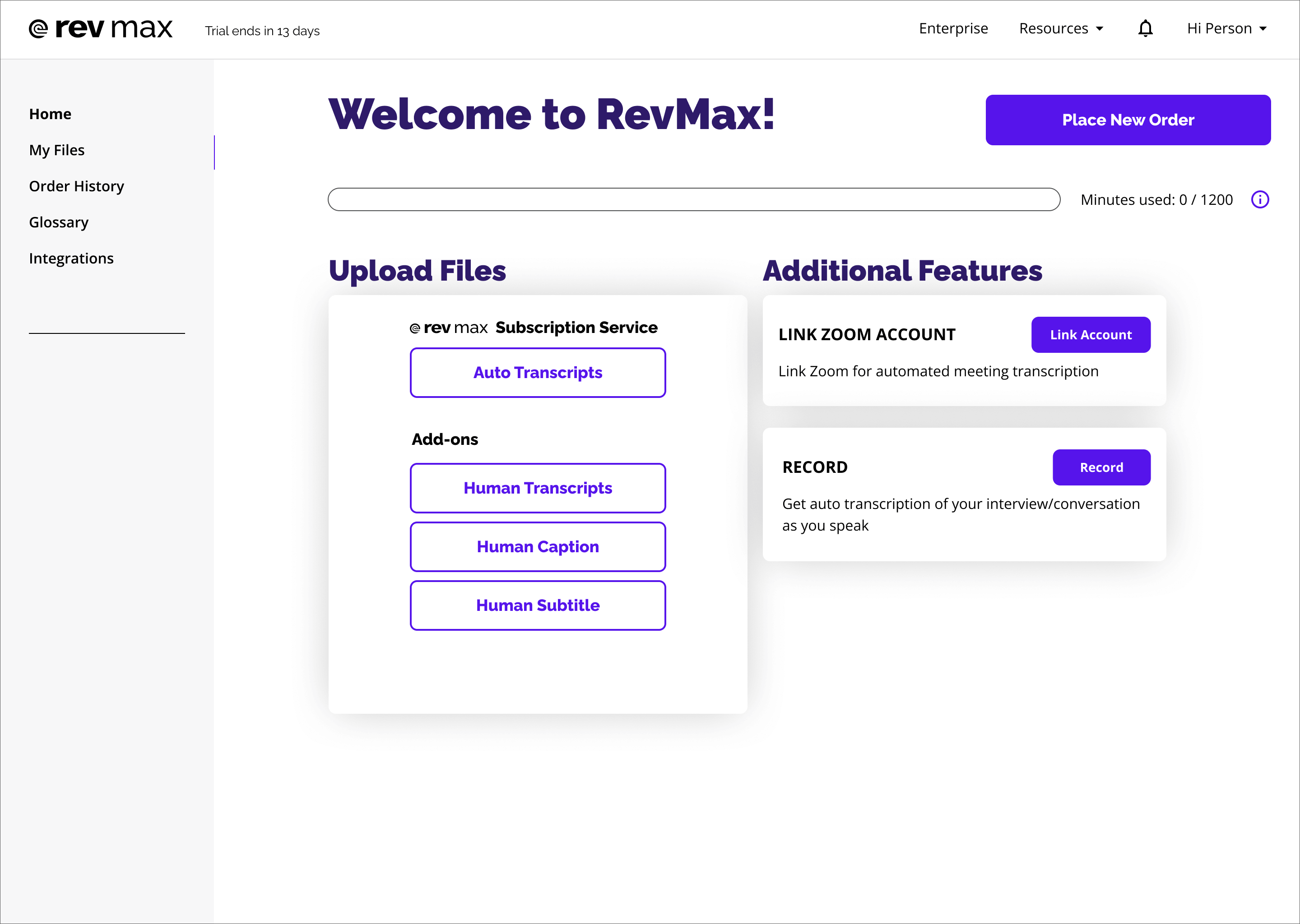
Rev Max users struggled to see what they were paying for, track usage, or understand upgrade value, which capped subscriptions. The bold purple color and overall look and feel also didn't reflect the premium brand that leadership wanted, so updates were needed across the board to bring the product from MVP to a consistent revenue stream.
Goals: Lift Subscriptions 25% Without Completely Rebuilding the Product
The initial design didn’t have much research behind it outside attempting to surface features that were known to be frequently used. I was asked to do user research targeted at improving the user experience with a goal of increasing subscribers by at least 25%, and there was also a request from leadership to make the product feel like a more premium offering.
Conversations with the marketing design team also revealed that we had a “purple on purple on purple” problem (comparisons to Grimace and Barney ran rampant) and that there was a desire to break up the monotone look.
Problem: A ‘Premium’ Plan That Users Didn’t Understand
The product managers and I started interviewing power users about their experience using the platform. Those interviews ranged from surprising (a court reporter with 4 accounts to provide enough minutes to cover all her interviews) to really interesting (I got to chat with some rather well known reporters whose work I read) to just kind of odd (let’s just say freelance journalists have some fun stories). Most of these users expressed similar issues: they couldn’t easily understand exactly what they were paying for, how much they’d used, or how to manage their plan.
We also found a goldmine of user pain points and feature needs: customer service. Our customer service team would post notable or repeated requests to a Slack channel for the product team to review, noting the frequency and severity of the issue. The majority of the items tended to reinforce things we’d heard in our user interviews, in particular that a number of users weren’t clear on what was and wasn’t included in their subscription. Taking steps to clarify that would help our users as well as reduce some occurrences of that repeated issue for customer service.
Designing a High‑Impact Record Screen That Sets the Tone for Rev Max
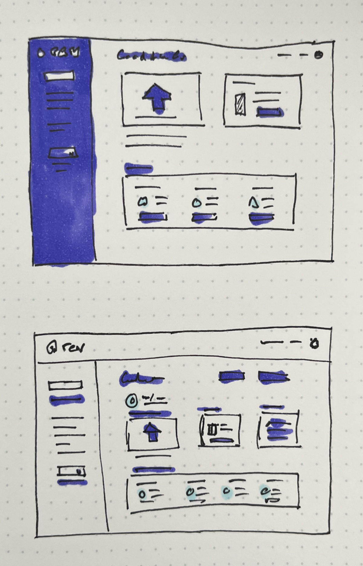
I had a lot of discussions with the PMs about the sort of look and feel we wanted, and after I'd sketched some rough concepts and mocked up a few ideas in Figma we decided to redesign the live recording and transcription feature as a first step.
Live recording was a fun way for users to test out the platform and see the AI transcription in action, but the existing module was a bit bland and didn't really show off how "cool" the feature was. I worked closely with an engineer to design and prototype some ideas for motion on the record screen, playing with a card style interface concept that we could easily expand to accomodate other areas of the interface. The team and leadership loved the new look, so I used this as a starting point to drive the look of the rest of the interface.
Surfacing the Right Info: A Single Status Card That Drives Clarity and Upgrades
After taking into account what we’d learned from interviews and customer service requests, the product managers and I decided that finding a way to clarify subscription status and account usage would be an easy win. The original UI had a somewhat clunky usage meter that took up a lot of space on screen and wasn’t easily read at a glance, while a user’s subscription status was buried in user settings.
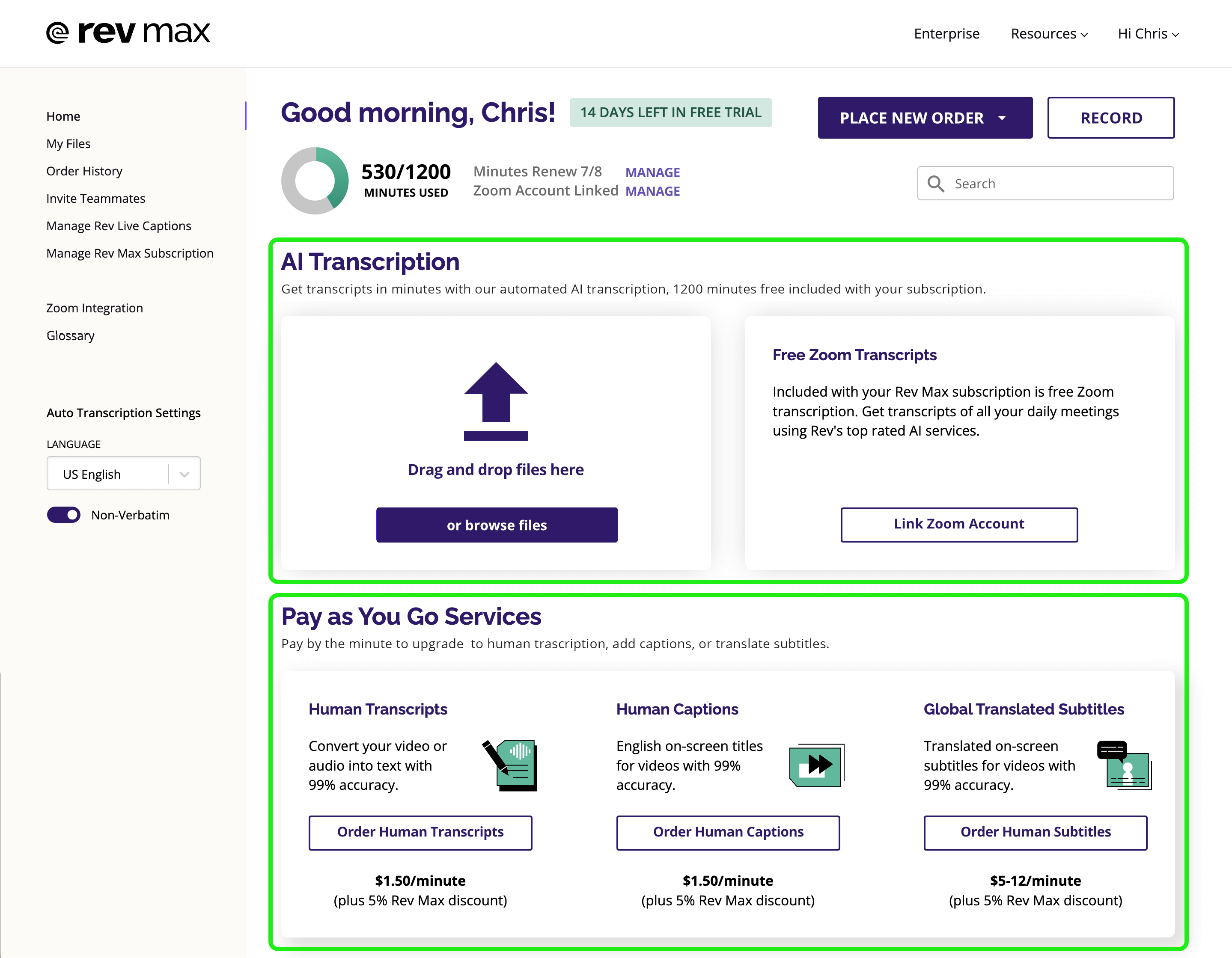
After some iteration I designed a more compact usage meter (affectionately called “the donut”) along with a manage subscription link that sat next to it. A newly designed tag was also added next to the account greeting to inform a user of their trial status or be used elsewhere for account alerts. The last piece was to add a Zoom account status link in that block to show whether a user had set up their account to do automatic transcription of Zoom meetings, so all together that created a convenient little dashboard where a user could see all of their critical settings at a glance. This was also the initial integration of a complementary color, introducing some green hues from the Rev brand’s secondary palette.
Making the Value Obvious: What Rev Max Actually Includes
To help clarify what was included in a user’s subscription we added descriptive labels and clearly segmented off the included AI services from the pay as you go services. In an effort to give users quicker access to their files, something we both heard in our interviews and saw frequently accessed in heat maps, I pitched a few different designs with a My Files view incorporated into the home screen but learned from the engineering team that the current iteration of My Files didn’t have this capacity. As an interim fix I was able to get a search bar added to the home screen so a user could find any file in their library with just one click, and an update to the My Files architecture is being discussed for sometime later this year.
A New Rev Max Home That Drives Clarity and Upgrades
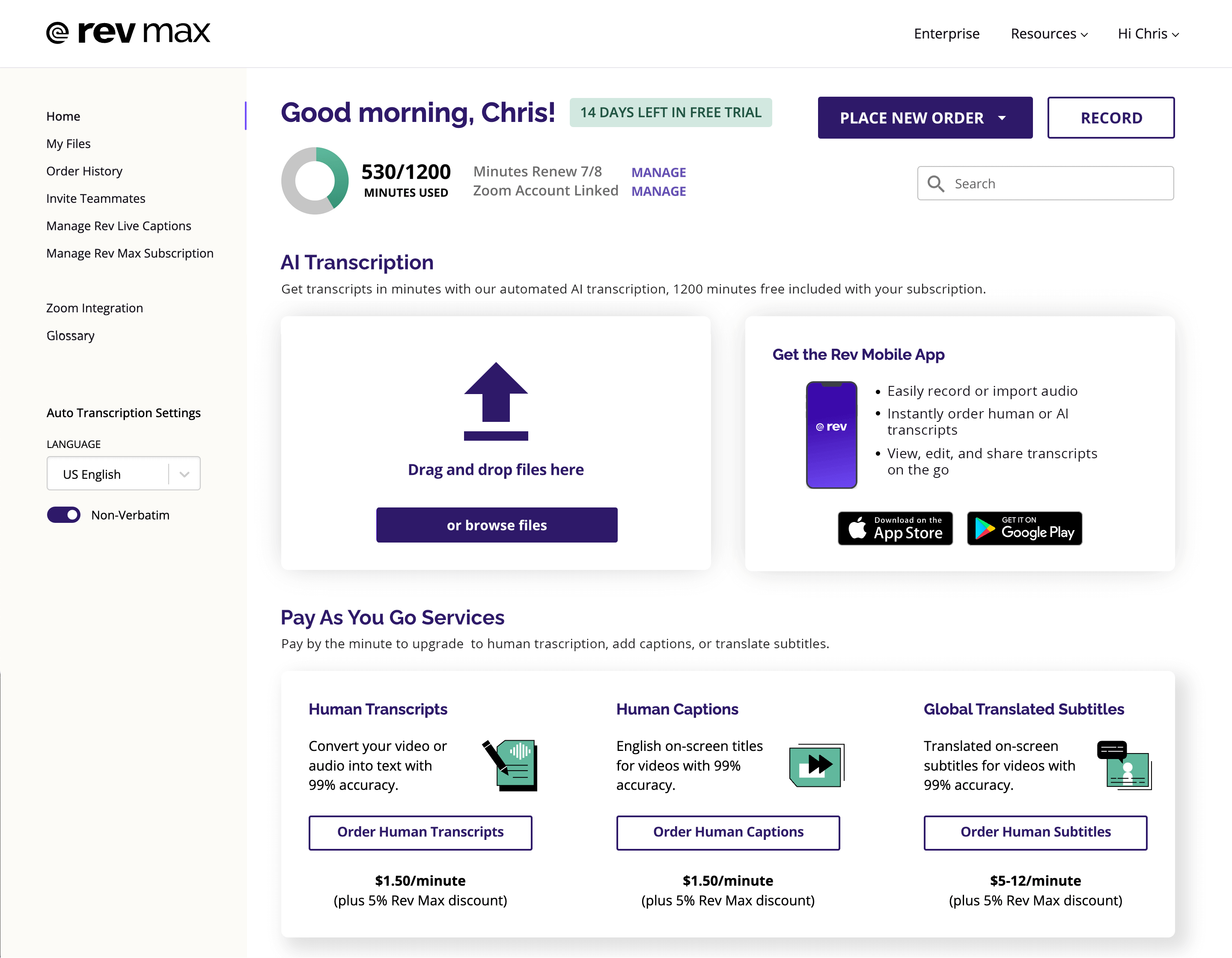
The revised design used the card style interface from the Record screen and integrated new elements like the usage meter and new search bar. Our customer interviews had indicated that regular users of the mobile app were generally very sticky and subscription data backed this up, so a link to the app was given a prominent spot on the home page to encourage users to try it out. Future iterations of Rev Max could utilize that space to show a user tips or point them towards new features based on their past usage and habits on the platform, rotating those cards as needed.
Iconography drawn by one of Rev's very talented marketing designers was introduced to differentiate the different available services, again bringing in some of the complementary green hues used on the usage meter. I worked with the creative director to make sure that the product design didn’t diverge dramatically from the brand look at any point, the marketing sites tended to use chunkier type and a lot of very bright purple so I went with a slimmer type weight and a darker purple hue to make things easier to read and feel a bit more professional.
Mobile App Upgrades That Won Users from a Key Competitor
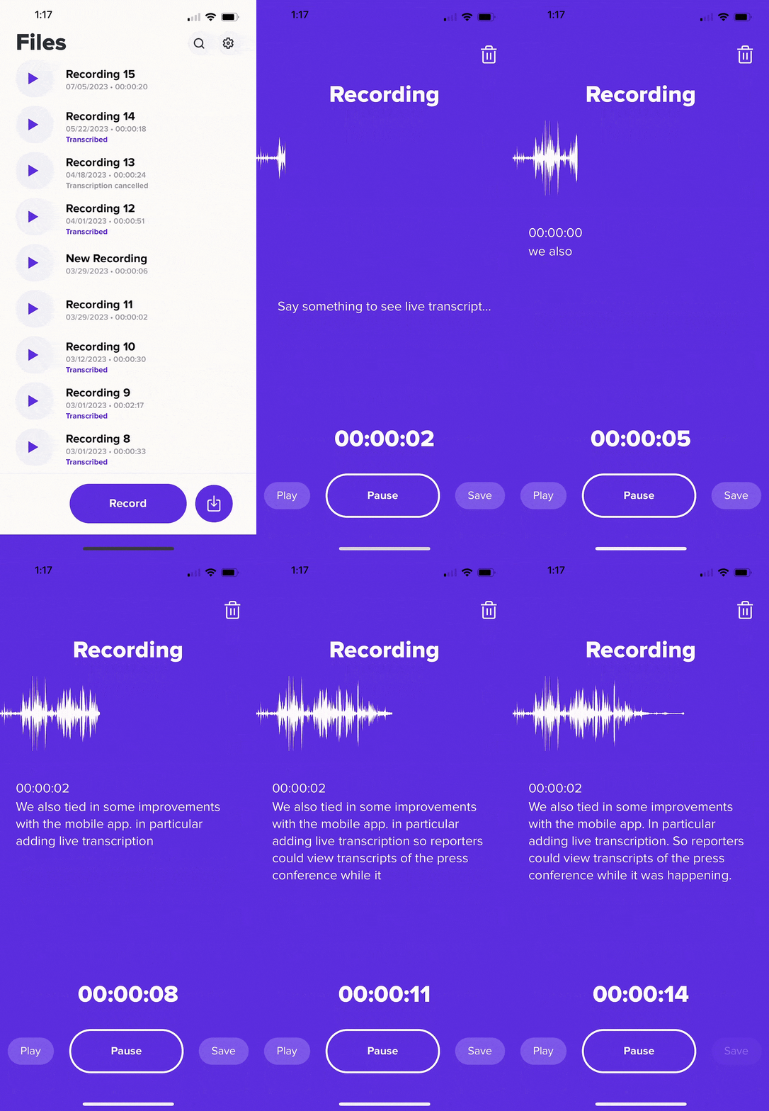
As mentioned a lot of our subscribers also utilized the mobile app, in particular journalists and interviewers. One frequent request was to add a live transcript view to the mobile app recording screen so that users could see the text as it was being spoken, something that was particularly useful in press conference situations where the listener might not be able to hear the speaker well. As I was also the lead designer on the mobile app team I made sure this feature was a priority, and we had a producer for a major sports network tell us that he'd left our competitor in favor of the Rev app after the feature was launched.
The Impact: 40% Subscription Growth in Six Months (and Climbing)
Subscriptions increased 40% as we made updates to the platform over six months and were up over 50% as of the time of this writing. Rev Max had evolved from a small MVP launch to a significant business for Rev and quickly became one of the primary areas of focus for new business.
The team has a lot of things planned for the next iterations of Rev Max, primarily working to unify the Rev Max interface across all the different Rev platforms for pay as you go users and enterprise users. A number of customization settings are also in the works for order preferences, custom glossary terms so the AI is familiar with frequently used terms, and frictionless checkout to enable users to more quickly send a file to transcription after recording.

